Scorecard Feature
Designed gamification elements for the mobile user experience to encourage positive driver behaviors, enhance engagement, and contribute to improved company performance scores—ultimately supporting reduced insurance costs through safer driving habits.
Web App (Mobile and Portal)
B2B, B2C
Supply Chain Logistics
Transflo Scorecard Feature – Summary:
The Transflo Scorecard is a driver performance tracking feature designed to promote safer, more efficient driving habits. It aggregates key telematics and behavioral data—such as speed, braking, idling, and fuel usage—into an easy-to-understand score. Drivers receive real-time feedback and performance rankings, while fleet managers gain actionable insights to coach teams and optimize operations. The Scorecard supports gamification, encouraging friendly competition and continuous improvement, and can help fleets lower insurance costs by promoting safety and compliance.
Services
Product Vision, UX Best Practice, Process Direction, Problem Statement breakdown, Product Design, Motion Design.
Client name
Transflo
Team
Lead Product Designer (John Karl), VP of Product, SME's
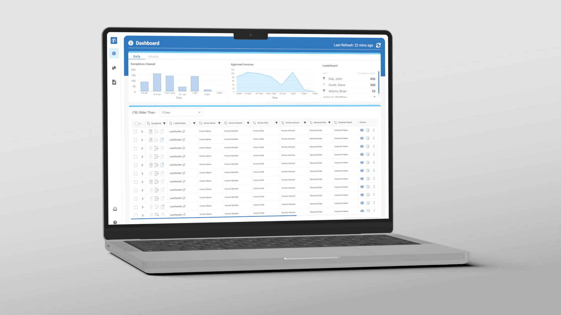
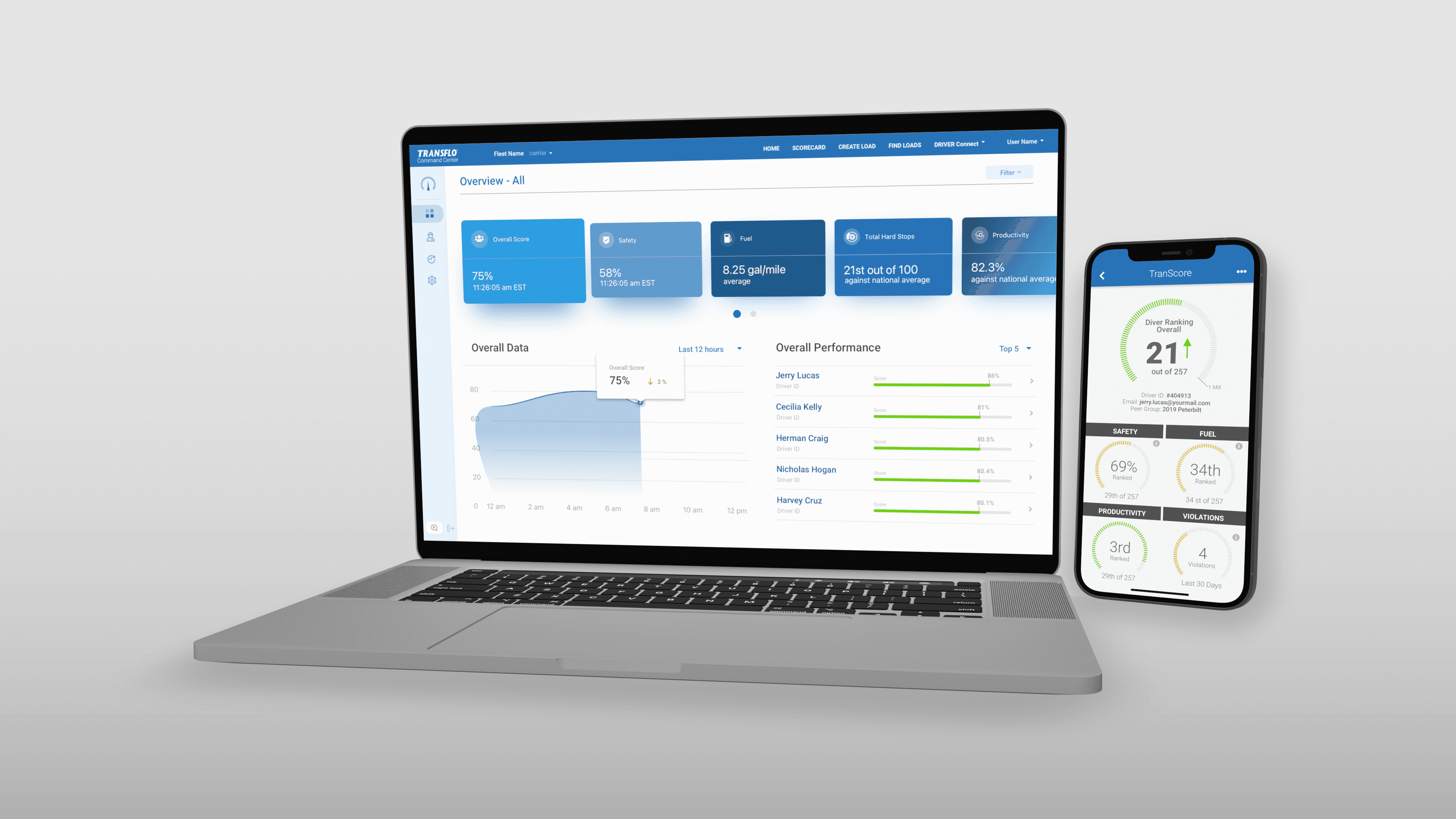
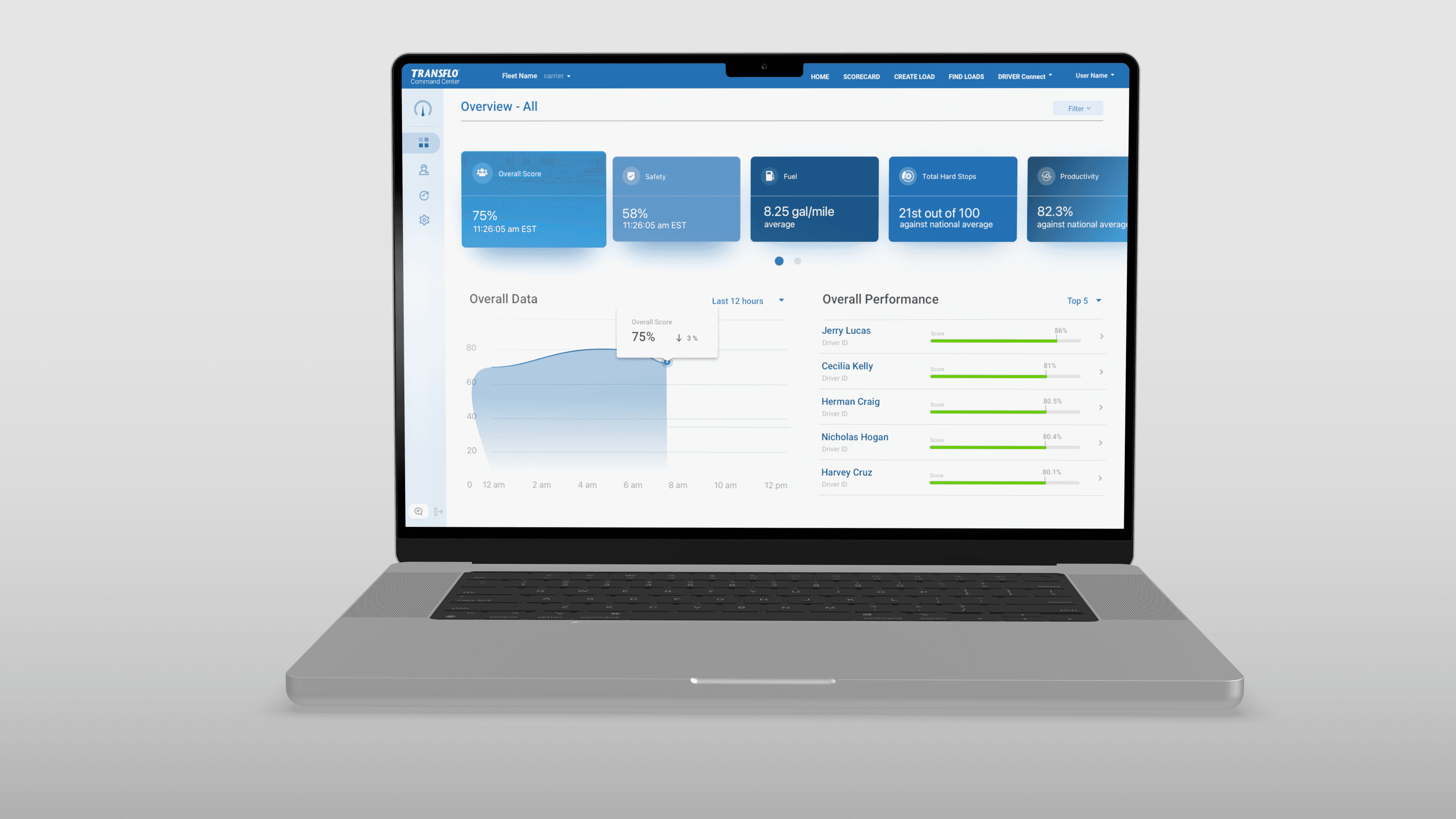
1. Prioritize Data Clarity with Hierarchy
Why it’s good:
The dashboard uses large cards and distinct sections (e.g., Overall Score, Safety, Fuel, etc.) to create a clear visual hierarchy, making the most important KPIs easy to spot at a glance.
UX Best Practice:
Maintain consistent visual weight for priority metrics.
Use iconography and concise labeling (like “Fuel” or “Productivity”) to support quick scanning.
2. Provide Actionable Feedback
Why it’s good:
Showing a red “↓ 3%” drop next to the score instantly informs users of a change that may need attention.
UX Best Practice:
Pair metrics with directional indicators (↑/↓) and tooltips or links for corrective actions or insights.
Offer contextual suggestions based on performance (e.g., “Your fuel efficiency dropped—consider reducing idle time.”)
3. Support Comparative Insights
Why it’s good:
Displaying “21st out of 100 against the national average” gives users a benchmarking reference for performance.
UX Best Practice:
Always include context when showing score metrics—users need to know what “good” looks like.
Offer toggles for comparisons (e.g., fleet vs. national average, driver vs. team average).
4. Enable Deeper Exploration
Why it’s good:
The presence of a filter and detailed driver list hints at deeper drill-down capabilities.
UX Best Practice:
Allow clickable elements (like driver names) to open detailed views or historical trends.
Include sorting/filtering by score, safety, fuel, and other KPIs for better user control.
5. Maintain Consistent Time Filters
Why it’s good:
The chart uses a time filter (“Last 12 hours”), which aligns the data trend with a time-based analysis.
UX Best Practice:
Ensure all cards update dynamically based on the selected time filter.
Provide presets (e.g., 24 hours, 7 days, 30 days) and a custom range for flexible exploration.
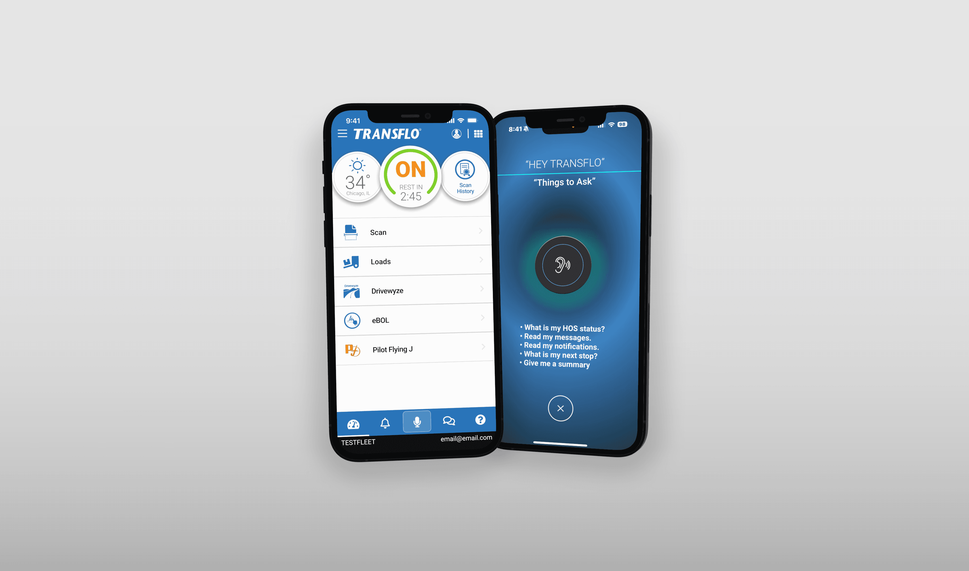
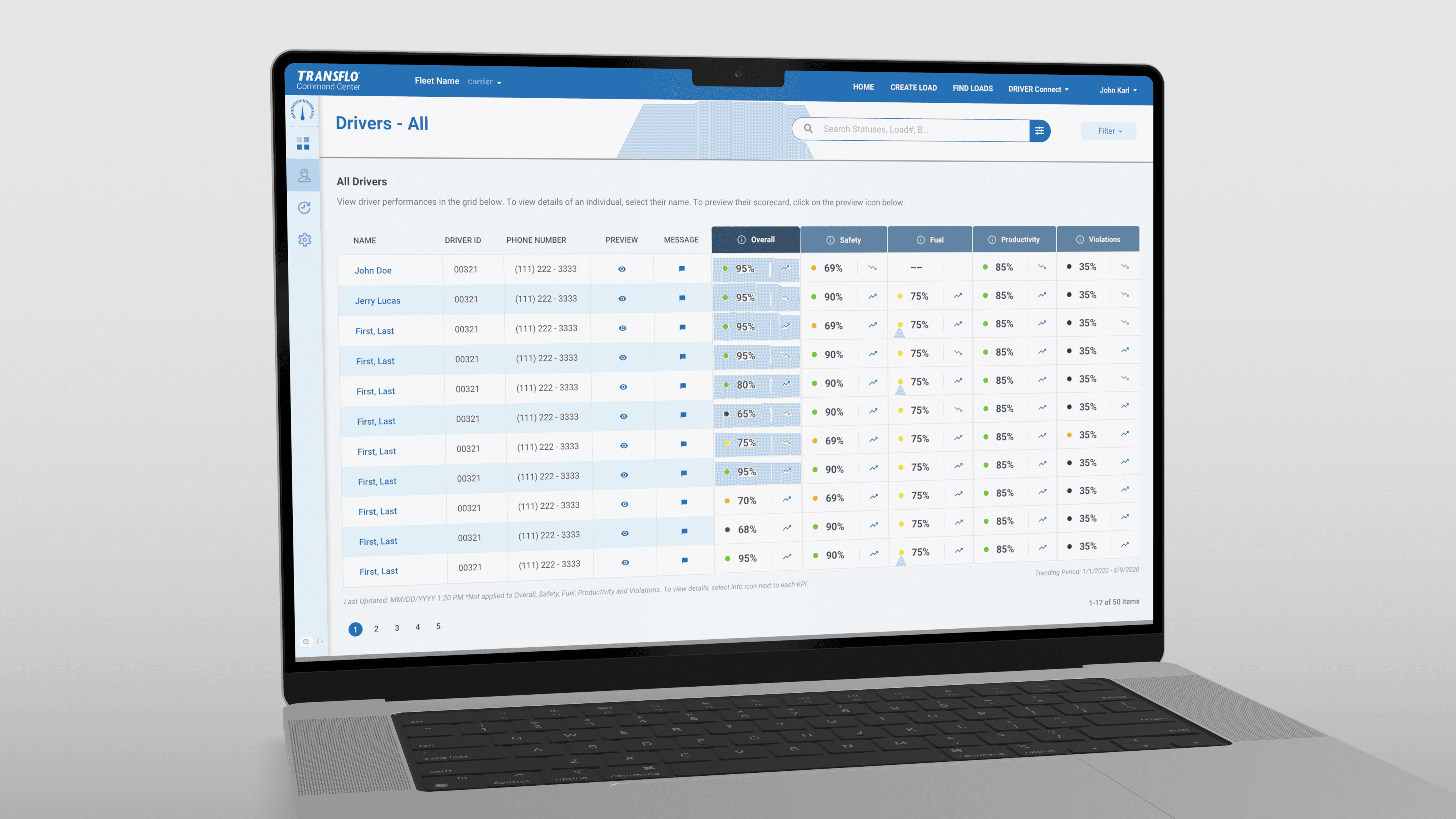
1. Color-Coded Performance Indicators
Problem Solved: Quickly identifying driver performance issues at a glance.
UX Function: Visual status dots (green, yellow, red) under each KPI column allow users to instantly assess risk levels without reading every value.
2. Driver Preview Icon (Eye Symbol)
Problem Solved: Reduces friction when accessing individual driver details.
UX Function: The “Preview” column enables one-click access to the driver's scorecard, saving time compared to navigating through menus.
3. Messaging Shortcut
Problem Solved: Facilitates fast communication between fleet managers and drivers.
UX Function: The message icon in each row allows the user to send a message directly from the table view, streamlining coaching or alerts.
4. Search and Filter Bar
Problem Solved: Locating specific drivers or status types in large datasets.
UX Function: The search bar and filter dropdown help users narrow down results, reducing the cognitive load and improving findability.
5. Performance Trends Visualization
Problem Solved: Difficulty spotting patterns in driver performance over time.
UX Function: Each KPI includes a trend graph icon, giving users insight into whether performance is improving or declining, helping prioritize coaching efforts.
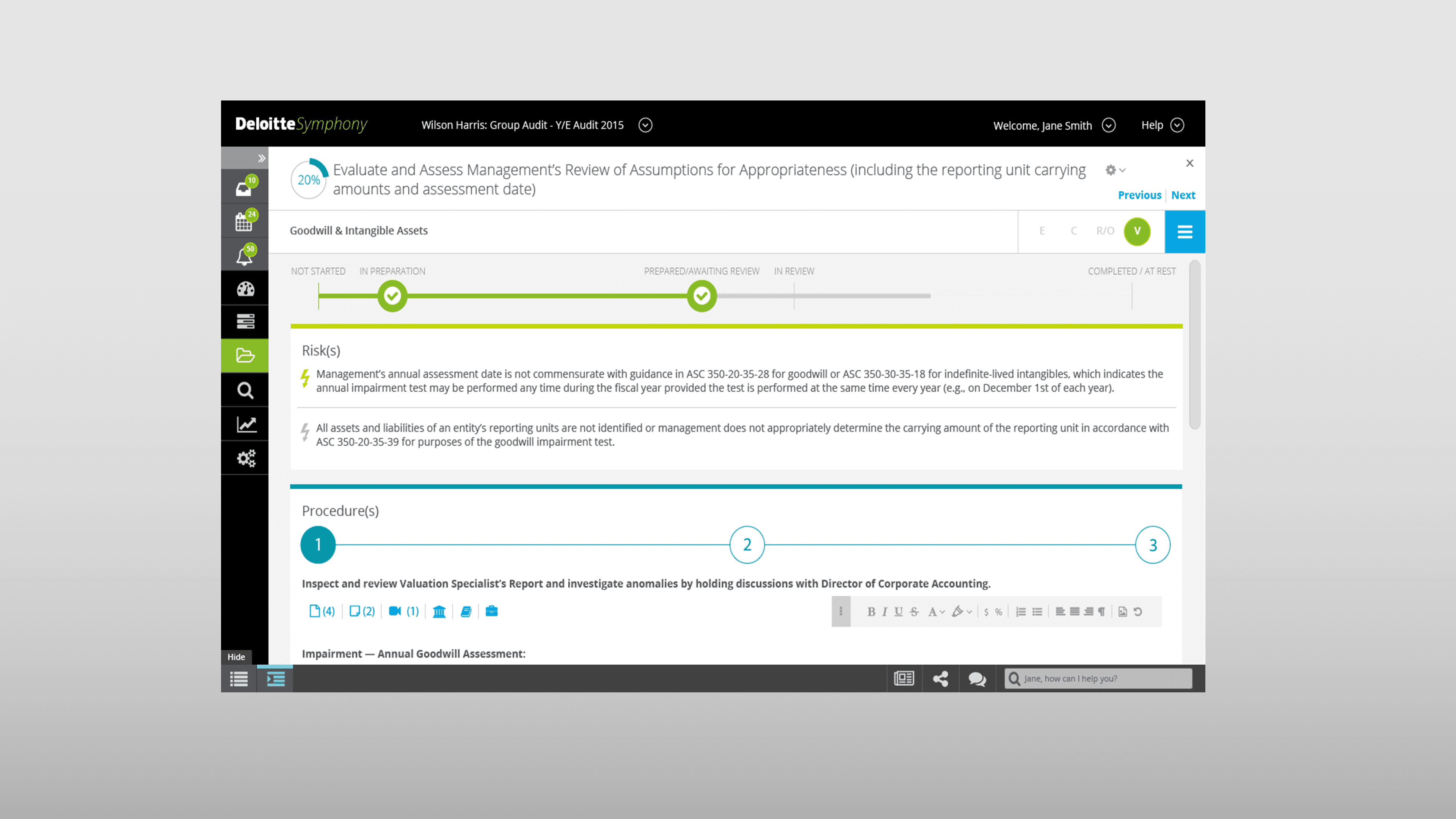
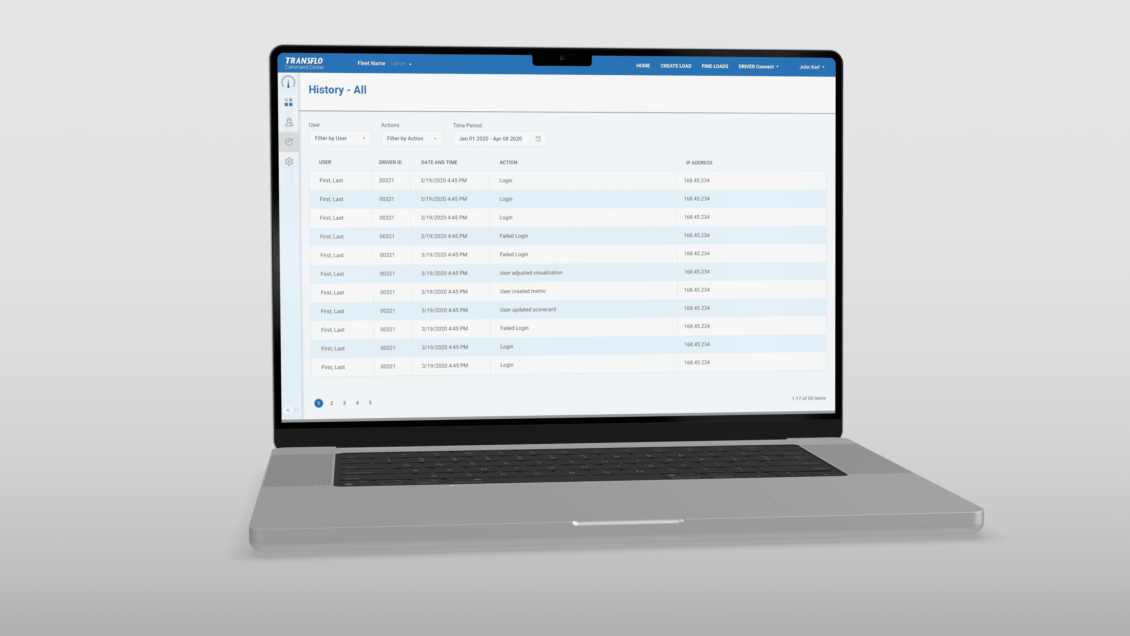
1. Filter by User and Action
Problem Solved: Difficulty sifting through large amounts of historical data.
UX Function: Dropdown filters for "User" and "Action" help users narrow down results to only relevant activity logs, saving time and cognitive load.
2. Date Range Selector
Problem Solved: Inability to audit activity for specific time periods.
UX Function: The calendar-based date picker allows users to define a custom time window for their audit or review, supporting targeted investigations and compliance reporting.
3. Clear Audit Trail
Problem Solved: Lack of visibility into user actions and system usage.
UX Function: Each row in the log provides structured details—action type, timestamp, IP address, and driver ID—giving administrators a full audit trail for accountability and traceability.
4. Action Descriptions
Problem Solved: Unclear user activity history.
UX Function: Specific, readable action labels (e.g., “User created metric,” “Failed Login,” “User updated scorecard”) ensure that the event log is understandable at a glance without decoding system jargon.
5. Pagination Controls
Problem Solved: Overwhelming data display that could hurt performance or usability.
UX Function: Pagination limits the number of rows per page, keeping the interface clean and responsive while making data navigation manageable.
Project Overview
The Transflo Scorecard Feature delivers a comprehensive, data-rich platform for fleet managers and driver performance monitoring. Through thoughtful design, intuitive interactions, and purposeful data visualization, the system empowers users to make informed decisions, improve safety, and optimize operations.
Key UX Strengths Across Screens
1. Dashboard Overview
Clear Information Hierarchy: Cards for Overall Score, Safety, Fuel, Productivity, and Violations prioritize what matters most at a glance.
Real-Time Feedback: Percentage changes and performance trends offer actionable insights.
Gamification Potential: Rankings and performance stats create a foundation for engagement and behavioral improvement.
2. Driver List Screen
Color-Coded Performance: Red, yellow, and green indicators allow rapid visual scanning of KPI status.
Quick Actions: Preview icons and message shortcuts streamline user workflows.
Search & Filter Tools: Help locate drivers or performance issues quickly, especially in large fleets.
Consistent UI Patterns: Uniform presentation across rows and columns supports usability and reduces cognitive load.
3. History Log Screen
Auditability: Logs include detailed action types, timestamps, and IP addresses for accountability and security tracking.
Custom Date Filters: Allow users to isolate time-specific activity during reviews or compliance checks.
Human-Readable Events: Clear descriptions like “User adjusted visualization” make logs understandable without training.
Pagination: Prevents information overload and ensures smooth navigation.
Unified UX Functions That Solve User Problems
Rapid Identification of risks, violations, and top performers through visual cues and trend indicators.
Efficiency in Workflow via quick access to previews, communications, and filtering.
Accountability through audit history and detailed driver actions.
Scalability for large fleets using consistent layouts, pagination, and search controls.
Data-Informed Decision-Making through transparent, real-time metrics and contextual scorecards.
Conclusion
The Transflo Scorecard's UX strikes a strong balance between functionality, usability, and visual clarity. It empowers fleet managers to track, coach, and optimize driver behavior while maintaining transparency and control. With continued iterative enhancements, it can become an industry-leading platform for data-driven fleet performance management.

Selected work
[2010 -2025]